Today, I had the honor of speaking at the here are the slides.
I want to be clear that this talk isn’t so much about scalability in the performance sense, but more in the IT Governance sense.
Why deployment can be a challenge
Deployments are pretty boring, just like most administration. You just hit publish, right? Figuring out the right solution for you is actually pretty difficult. So why is that?
Too many options
There are at least 9 different ways that you can deploy your Power BI reports:
- Sharing Dashboards / Reports
- Sharing Workspaces
- Organizational content Packs
- “Apps”
- SharePoint Embedding
- Power BI Premium
- Publish to Web
- Power BI Report Server
- Power BI Embedded
So you have all of these different options to choose from and at time it can be confusing. Which method makes sense for your organization?
It keeps changing
Even worse, Power BI is rapidly being iterated on. This is great for users, but a challenge for people trying to keep up with the technology. One year ago the following deployment options modes didn’t exist.
- Sharing individual reports (Jan 2018)
- “Apps” (May 2017)
- SharePoint Embedding (Feb 2017)
- Power BI Premium (May 2017)
- Power BI Report Server (June 2017)
- Power BI Embedded V2 (May 2017)
It can be a real challenge to keep up. I think that a lot of the dust has settled when it comes to deployment options. I don’t see them adding a lot of new methods. But I expect there to be many small tweaks as time goes on. In fact I had to make two changes to my slides this morning because they announced changes yesterday!
Organizing by scale
So, how can we get our arms around all of these different options. How can we organize it mentally?
One way of approaching this is who do you want to share with? Do you need to reach 5 users, 50 users, 500 users, or 5000 users?

This is the framework that I use in the presentation and the rest of the blog post.
Before we jump into the different ways to deploy your reports, we need to talk briefly about the dirty little secret of self-service BI:
Self-service is code for “undermining IT authority”
Any time you make it easier for Chris in accounting to create and share reports without having to talk to Susan in IT, you chip away bit-by-bit at IT authority This isn’t always a bad thing. Sometimes the process governing your IT strategy is a bureaucracy.

The reason I bring it up is that you’ll find that the more users we need to reach, the more of a centralized structure we need to support it. Dashboard sharing is great for 5 users but is horrific for 5000 users. It’s just like building a tower or skyscraper. The requirements for a 10 foot building are drastically different than a 100 foot building.
Sharing with your Team

So let’s say you want to share with your team, just a handful of people. Well the good news is it’s pretty easy. You hit publish and you click share.
First you have to publish
Whenever you make a report in Power BI Desktop you have to hit the Publish button to push it out to the Power BI Service, a.k.a PowerBI.com.

Whenever you do that, you are going to be asked what workspace you want to push it to.

A workspace is basically a container for all of your report artifacts: dashboards, reports and data sets.
Dashboard sharing
The quickest and easiest way to deploy reports is direct sharing. Once you’ve published a report, you can create a dashboard by pinning visualizations to it.

One it’s created, then you can hit the share button:

From that point you will be asked who you want to add. When you add users to a dashboard you can either given them read-only permissions or the ability to read and share.
Report sharing
Last month, they added the ability to share individual reports as well. The overall process is the same. Upload the report, hit share. The difference is now we can finally do that without creating a dashboard.
Workspace Sharing
So let’s say that you actually want to collaborate with other people on reports, or at the very least keep them all organized in a central location. The quickest and easiest way to do that is to share the whole workspace.
When you share a workspace you can make people either admins or members. You can also decide if you want those members to be read only, or able to edit the contents of that workspace.
This is ideal for collaboration or sharing with small groups. But if you have to support 100 users, it can start to break down, especially if all the members have edit privileges. Let’s take a look at the next level of scale.
Sharing with Power BI Users

Okay, you’ve been able to share with a handful of users. But now, you need to deploy “production” reports. This means having some sort of QA processes and a way to centrally manage things. We need to step up our game.
Organizational content packs
Organizational content packs were the original way of wrapping Power BI content in a nice bow and sharing it with the whole organization. Unfortunately they are now deprecated and have been mostly replaced by apps. Mostly.
The one use case for content packs is for user customizations. Whenever you share an app, the user gets the latest version of that app. With content packs, a user can download the pack and make personalization’s to their copy.
Business Intelligist has a good post breaking down some of the differences.
Power BI Apps
Power BI Apps are the definitive way to share content within your organization. A Power BI app is essentially a shared workspace with a publish button and some nice wrapping around it.
Apps provide a number of benefits:
- QA and staging. Review your reports before deploying.
- Selective staging. Work on reports without having to publish them.
- Professional wrapping. Add a logo, description and landing page to your content.
- Canonical Versioning. By using vehicles like Apps, you can have company endorsed reports.
To Share an App, you hit publish and are given a URL to distribute. Users can also search for your app. In the future, you will be able to push content out to your users directly.
Sharing with your whole organization

So let’s say that you want to expand your reach and share reports with everyone in the entire organization. In that case you will either need to a) change your licensing approach, b)move away from powerbi.com, or c) both.
Power BI Premium
Power BI Premium is ideal if you have lots of users and lots of money. With Premium, instead of licensing users you license capacity. You are essentially paying for the VMs behind power bi service instead of the individual users viewing the content.
Power BI Premium is a licensing strategy, not a deployment strategy. The deployment is secondary.
Remember what I said about lots of money? The full Power BI Premium SKUs start at $5000 per month. If you are paying $10 per user per month, the break-even starts around 500 users. That’s a lot of users.
From a user experience perspective standpoint, absolutely nothing changes with changes. you mark a workspace as premium, and now it’s isolated and free to users.

Image source: Microsoft
Power BI Premium also offers scalability benefits. Larger data sets, better performance, more frequent refreshes. If you are bumping up against the limits of the Power BI Service, Power BI Premium might make sense for you. The whitepaper goes into much more detail.
SharePoint Online Embedding
If your organization has made heavy investments in SharePoint, it may make sense to use SharePoint as the front-end instead of powerbi.com
To deploy a report to SharePoint Online, crate a new page and then add the Power BI Web Part.
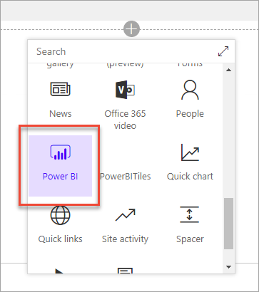
Image Source: Microsoft
Once you add the web part, you have to specify the URL of your report and you are done.
From a licensing perspective, users with need to have Power BI Pro, or you can use the EM SKUs of Power BI Premium. The EM levels with cost you $625-$2495 per month.
Power BI Report Server
EDIT: This section is incorrect and will be updated. Please see David’s comment at the bottom.
For a long time, the #1 requested feature was Power BI on-premises. Power BI Report Server is basically SSRS with support for rendering Power BI reports. The deployment story is very similar to SSRS reports. Users would go to the web portal and open up reports from there.
Unless you have data sovereignty regulations or highly confidential data, you shouldn’t use Power BI Report Server. The first reason is that it is very expensive. There are two ways to get Power BI Report Server:
- Licensing is included with Power BI Premium
- SQL Server Enterprise Edition + Software Assurance
The other issue is that Power BI Report Server is that it is still limited:
- No support for Dashboards
- No support for Scheduled Refresh
- No Q/A or Cortana support
I expect that they are going to continue to improve upon PBI Report Server, but as with an on-prem solution, it’s always going to be lagging behind the SaaS model.
Sharing with everyone

So let’s say that you want to go a little bit broader, what if you want to share with people outside of your organization. What if you want to share with everyone?
Publish to Web
The simplest and easiest way to share with people is to use Publish to Web. When you publish a report you will be given a public URL and an iframe for embedding.

If you use publish to web, it’s completely free to anyone to view. However, your data is publicly available. Anyone with access to the URL can view the underlying data. If this sounds bad, be aware that you can disable publish to web at the tenant level or for specific security groups.
Power BI Embedded
To use Power BI Embedded, you are going to need a web developer. There are no two ways about it. And web developers are expeeeensive.

Power BI Embedded allows you to use Javascript to control and embed Power BI reports in your web application. One of the consequences of using Power BI Embedded id you are going to have to roll your own security. You aren’t going to be giving users access like normal.
The other thing to know about Power BI embedded is that it depends on Power BI Premium to back it. So you are paying for capacity, not users. In this case you are using the A SKUs, which cost $725-$23,000 per month. That will get you 300-9600 render per hour.
If you want to start playing around with it, there are samples available.
External Sharing
While this isn’t a way to share with thousands of external users, it bears mentioning that you can share with external users. This is ideal if you have a handful of external clients. The overall user experience is largely the same. The big difference is that their account can live in a different Azure Active Directory tenant.
I won’t go into detail about it here, but check this link out if you want to learn more. There is also a whitepaper (AAD B2B) that goes into even more detail.
What now?
If you head isn’t spinning from all the information, definitely check out the deployment whitepaper. Chris Webb and Melissa Coates go into excruciating detail into all of your options and all the different details to consider.