TL;DR – The fastest local format for importing data into Power BI is Parquet and then….MS Access?
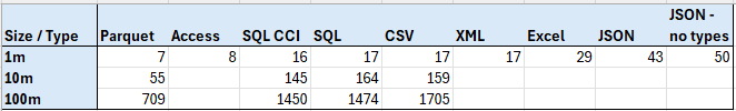
The chart above shows the number of seconds it took to load X million rows of data from a given data source, according to a profiler trace and Phil Seamark’s Refresh visualizer. Parquet is a clear winner by far, with MS Access surprisingly coming in second. Sadly the 2 GB file limit stops Access from becoming the big data format of the future.
Part of the reason I wanted to do these tests is often people on Reddit will complain that their refresh is slow and their CPU is maxed out. This is almost always a sign that they are importing oodles and oodles of CSV files. I recommended trying Parquet instead of CSV, but it’s nice to have concrete proof that it’s a better file source.
For clarification, SQL_CCI means I used a clustered columnstore index on the transaction table and “JSON – no types” means all of the data was stored as text strings, even the numbers.
Finally, if you like this kind of content, let me know! This took about 2 days of configuration, prep, and testing to do. It also involved learning things that the Contoso generated dataset has Nan as a given name, which my python code interpreted as NaN and caused Power BI to throw an error. I’m considering doing something similar for Fabric data sources when Fabric DBs show up in my tenant.
Methodology
All of these test were run on my GIGABYTE – G6 KF 16″ 165Hz Gaming Work Laptop (don’t tell my accountants). It has an Intel i7-13620H 2.40 GHz processor, 32 GB of RAM, and a Gigabyte ag450e1024-si secondary SSD. The only time a resource seemed to be maxed out was my RAM for the 100 million row SQL test (but not for columnstore). For SQL Server, I was running SQL Server 2022.
The data I used was the Contoso generated dataset from the folks at SQLBI.com. This is a great resource if you want to do any sort of performance testing around Star Schema data. I had to manually convert it to JSON, XML, Excel and MS Access. For Excel, I had to use 3 files for the transaction table.
Initially, I was planning on testing in 10x increments from 10k rows to 100m. However, MS Access imported in under a second for both 10k and 100k, making that a useless benchmark. Trying to convert the data to more than 1m rows of data for XML, JSON, and Excel seemed like more work than it was worth. However, if someone really wants to see those numbers, I can figure it out.
For recording the times, I did an initial run to warm any caches involved. Then I ran and recorded it 3 times and reported the median time in seconds. For 100m rows, I took so long I just reported the initial run, since I didn’t want to spend half an hour importing data 4 times over.
Want to try it yourself? Here’s a bunch of the files and some sample at the 10k level:
Perf Data – local import blog.zip
What to learn more?
If you want to learn more about performance tuning Power BI, consider checking out my training course. You can use code ACCESS24 to get it for $20 until Dec 6th.