I’m delighted to announce the launch of the Figuring out Fabric Podcast. Currently you can find it on Buzzsprout (RSS feed) and YouTube, but soon it will be coming to a podcast directory near you.
Each week I’ll be interviewing experts and users alike on their experience with Fabric, warts and all. I can guarantee that we’ll have voices you aren’t used to and perspectives you won’t expect.
Each episode will be 30 minutes long with a single topic, so you can listen during your commute or while you exercise. Skip the topics you aren’t interested in. This will be a podcast that respects your time and your intelligence. No 2 hour BS sessions.
In our inaugural episode, Kristyna Ferris helps us pick the right data movement tool.
If you know Betteridge’s Law of Headlines, then you know the answer is no. But let’s get into it anyway.
Recently there was LinkedIn post that made a bunch of great and valid points but ended on an odd one.
Number one change would be removing Power BI from Fabric completely and doubling down on making it even easier for the average business user, as I have previously covered in some posts.
It’s hard for me to take this as a serious proposal instead of wishful thinking, but I think the author is being serious, so let’s treat it as such.
Historically, Microsoft has failed to stick the landing on big data
If you look back at the family tree of Microsoft Fabric, it’s a series of attempts to turn SQL Server into MPP and Big Data tools. None of which, as far as I can tell, ever gained significant popularity. Each time, the architecture would change, pivoting to the current hotness (MPP -> Hadoop -> Kubernetes -> Spark -> Databricks). Below are all tools that either died out or morphed their way into Fabric today.
(2010). Parallel Data Warehouses. A MPP tool by DataAllegro that was tied to a HP Hardware Appliance. Never once did I hear about someone implementing this.
(2014)Analytics Platform System. A rename and enhancement of PDW, adding in HDInsight. Never once did I hear about someone implementing this. Support ends in 2026.
(2015) Azure SQL Data Warehouse. A migration of APS to the cloud, providing the ability to charge storage and compute separately. Positioned as a competitor to Redshift. I may have rarely heard of people using this, but nothing sticks out.
(2019). Big Data Clusters. An overly complicated attempt to run a cluster of SQL Server nodes on Linux, supporting HDFS and Spark. It was killed off 3 years later.
(2019) Azure Synapse Dedicated Pools. This was a new paint of coat Azure SQL Data Warehouse, put under the same umbrella as other products. I have in fact heard of some people using this. I found it incredibly frustrating to learn.
(2023) Microsoft Fabric. Yet another evolution, replacing Synapse. Synapse is still supported but I haven’t seen any feature updates, so I would treat it as on life support.
That’s 6 products in 13 years. A new product every 2 years. If you are familiar with this saga, I can’t blame you for being pessimistic about the future of Fabric. Microsoft does not have a proven track record here.
Fabric would fail without Power BI
So is Fabric a distraction? Certainly. Should Power BI just be sliced off from Fabric, so it can continue to be a self-service B2C tool, and get the attention it deserves? Hell, no.
In my opinion, making such a suggestion completely misses the point. Fabric will fail without Power BI, full stop. Splitting would mean throwing in the towel for Microsoft and be highly embarrassing.
The only reason I have any faith in Fabric is because of Power BI and the amazing people who built Power BI. The only reason I have any confidence in Fabric is because of the proven pricing and development model of Power BI. The only reason I’m learning Fabric is because the fate of the two is inextricably bound now. I’m not doing it because I want to. We are all along for the ride whether we like it or not.
I have spent the past decade of my career successfully dodging Azure. I have never had to use Azure in any of my work, outside of very basic VMs for testing purposes. I have never learned how to use ADF, Azure SQL, Synapse, or any of that stuff. But that streak has ended with Fabric.
My customers are asking me about Fabric. I had to give a 5 day Power BI training, with one of the days on Fabric. Change is coming for us Power BI folks and I think consultants like me are mad that Microsoft moved our cheese. I get it. I spent a decade peacefully ignorant of what a lakehouse was until now, blah.
Is Power BI at risk? Of course it is! Microsoft Fabric is a massively ambitious project and a lot of development energy is going into adding new tools to Fabric like SQL DBs as well quality of life improvements. It’s a big bet and I estimate it will be another 2-3 years until it feels fully baked, just like it took Power BI 4 years. It’s a real concern right now.
Lastly, the logistics of detachment would be so complex and painful to MSFT that suggesting it is woefully naive. Many of the core PBI staff were moved to the Synapse side years ago. It’s a joint Fabric CAT team now.
Is MSFT supposed undo the deprecation of the P1 SKU and say “whoopsie-daisy”? “Hey sorry we scared you into signing a multi-year Fabric agreement, you can have your P1 back”? Seriously?
No, Odysseus has been tied to the mast. Fabric and Power BI sink or swim together. And for Power BI consultants like me, our careers sink or swim with it. Scary stuff!
Where Microsoft can do better
Currently I think there is a lot of room for improvement in the storytelling around which product to use when. I think there is room for improvement from massive tables and long user scenarios. I would love to see videos with clear do’s and don’ts, but I expect those will have to come from the community. I see a lot of How To’s from my peers, but I would love more How To Nots.
I really want to see Microsoft take staggered feature adoption seriously. Admin toggles are not scalable. It’s not an easy task, but I think we need something similar to roles or RBAC. Something like Power BI workspace roles, but much, much bigger. The number of Fabric items you can create is 5x the number of Power BI items and growing every day. There needs to be a better middle ground than “turn it all off” or “Wild West”.
One suggestion made by the original LinkedIn author was a paid addon for Power BI pro that adds Power BI Copilot. I think we absolutely do not need that right now. Copilot is expensive in Fabric ($0.32 -$2.90 per day by my math) and still could use some work. It needs more time to bake as LLM prices plummet. If we are bringing Fabric features to a shared capacity model, let’s get Fabric Per User and let’s do it right. Not a rushed job because of some AI hype.
Also, I don’t get why people are expecting a copilot addon or FPU license already. It was 4 years from Power BI Premium (2017) to Premium Per User (2021). It was 3 years from Paginated reports in Premium (2019) until we got Paginated reports in Pro (2022). Fabric has been out for less than 2 years and it is having a lot of growing pains. Perhaps we can be more patient?
How I hope to help
People are reasonably frustrated and feeling lost. Personally, I’d love to see more content about real, lived experiences and real pain points. But complaining only goes so far. So, with that I’m excited to announce the Figuring Out Fabric podcast coming out next week.
You and I can be lost together every week, together. I’ll ask real Fabric users some real questions about Fabric, and we’ll discuss the whole product, warts and all. If you are mad about Fabric, be mad with me. If you are excited about Fabric, be excited with me.
I continue to be really frustrated about the dogmatic approach to Power BI. Best practices become religion, not to be questioned or elaborated on. Only to be followed. And you start to end up with these 10 Power BI modeling commandments:
Thou shalt not use Many-to-Many
Thou shalt not use bi-directional filtering
Thou shalt not use calculated columns
Thou shalt not use implicit measures
Thou shalt not auto date/time
Thou shalt avoid iterators
Thou shalt star schema all the things
Thou shalt query fold
Thou shalt go as upstream as possible, as downstream as necessary
Thou shalt avoid DirectQuery
And I would recommend all of these. If you have zero context and you have a choice, follow these suggestions. On average, they will lead to better user experiences, smaller models, and faster performance.
On. Average.
On. Average.
But there’s problems when rules of thumb and best practices become edicts.
Why are people like this?
I think this type of advice comes from a really good and well-intentioned place. First, my friend Greg Baldini likes to point out that Power BI growth has been literally exponential. In the sense that the number of PBI users today is a multiple of PBI users a year ago. This means that new PBI users always outnumber experienced PBI users. This means we are in Eternal September.
I answer questions on Reddit, and I don’t know how many more times I can explain why Star Schema is a best practice (it’s better for performance, better for user experience, and leads to simpler DAX, BTW). Many times, I just point to the official docs, say it’s a best practice and move on. It’s hard to fit explanations in 280 characters.
The other reason is that Power BI is performant, until it suddenly isn’t. Power BI is easy, until it suddenly isn’t. And as Power BI devs and consultants, we often have to come in and clean the messes. It’s really tempting to scream “If you had just followed the commandments, this wouldn’t have happened. VertiPaq is a vengeful god!!!”.
I get it. But I think we need to be better in trying to teach people to fish, not just saying “this spot is good. Only fish in this bay. Don’t go anywhere else.”
Why we need to do better
So why does it matter? Well, a couple of reasons. One is it leads to people not digging deeper to learn internals and instead they hear what the experts say and just echo that. And sometimes that information is wrong. I ran into that today.
Someone on Reddit reasonably pushed back on me suggesting SUMX, violating commandment #6, which is a big no no. I tried to explain that in the most simple cases, SUM and SUMX are identical under the hood: identical performance, identical query plans, etc. SUM is just syntactic sugar for SUMX.
Here was the response:
That’s really overcomplicating things. No point in skipping best practices in your code. He doesn’t need to know such nuances to understand to avoid SUMX when possible
And no, sumx(table,col) is not the same as sum(col). One iterates on each row of the table, one sums up the column
And this was basically me from 2016 until….um….embarrassingly 2022. I knew iterators were bad, and some were worse than others. People said they were bad, so I avoided them. I couldn’t tell you when performance became an issue. I didn’t know enough internals to accurately intuit why it was slow. I just assumed it was like a cursor in SQL.
I then repeated in my lectures that it was bad sometimes. Something something nested iterators. Something something column lookups. I was spreading misinformation or at least muddled information. I had become part of the problem.
And that’s the problem. Dogma turns off curiosity. It turns off the desire to learn about the formula engine and the storage engine, to learn about data caches, to know a system deep in your bones.
Dogma is great when you can stay on the golden path. But when you deviate from the path and need to get back, all you get is a scolding and a spanking. This is my concern. Instead of equipping learners are we preparing them to feel utterly overwhelmed when they get lost in the woods?
How we can be better
I think the path to being better is simple.
Avoid absolutist language. Many of these commandments have exceptions, a few don’t. Many lead to a better default experience or better performance on average. Say that.
Give reasons why. In a 280 character post, spend 100 characters on why. The reader can research if they want to or ask for elaboration.
Encourage learning internals. Give the best practice but then point to tools like DAX studio to see under the hood. Teach internals in your demos.
Respect your audience. Treat your audience with respect and assume they are intelligent. Don’t denigrate business users or casual learners.
It’s hard to decide how much to explain, and no one want to fit a lecture into their “TOP 10 TIPS!” post. But a small effort here can make a big difference.
The more I tried to research practical ways to make use of ChatGPT and Power BI, the more pissed I became. Like bitcoin and NFTs before it, this is a world inextricably filled with liars, frauds, and scam artists. Honestly many of those people just frantically erased blockchain from their business cards and scribbled on “AI”.
There are many valid and practical uses of AI, I use it daily. But there are just as many people who want to take advantage of you. It is essential to educate yourself on how LLMs work and what their limitations are.
Other than Kurt Buhler and Chris Webb, I have yet to find anyone else publicly and critically discussing the limitations, consequences, and ethics of applying this new technology to my favorite reporting tool. Aside from some video courses on LinkedIn Learning, nearly every resource I find seems to either have a financial incentive to downplay the issues and limitations of AI or seems to be recklessly trying to ride the AI hype wave for clout.
Everyone involved here is hugely biased, including myself. So, let’s talk about it.
Legal disclaimer
Everything below is my own personal opinion based on disclosed facts. I do not have, nor am I implying having, any secret knowledge about any parties involved. This is not intended as defamation of any individuals or corporations. This is not intended as an attack or a dogpile on any individuals or corporations and to that effect, in all of my examples I have avoided directly naming or linking to the examples.
Please be kind to others. This is about a broader issue, not about any one individual. Please do not call out, harass, or try to cancel any individuals referenced in this blog post. My goal here is not to “cancel” anyone but to encourage better behavior through discussion. Thank you.
LLMs are fruit of the poisoned tree
Copyright law is a societal construct, but I am a fan of it because it allows me to make a living. I’m not a fan of it extending 70 years after the author’s death. I’m not a fan of companies suing against archival organizations. But If copyright law did not exist I would not have a job as a course creator. I would not be able to make the living I do.
While I get annoyed when people pirate my content, on some level I get it. I was a poor college student once. I’ve heard the arguments of “well they wouldn’t have bought it anyway”. I’ll be annoyed about the $2 I missed out on, but I’ll be okay. Now, if you spin up a BitTorrent tracker and encourage others to pirate, I’m going to be furious because you are now directly attacking my livelihood. Now it is personal.
Whatever your opinions are on the validity of copyright law and whether LLMs count as Fair Use or Transformative Use, one thing is clear. LLMs can only exist thanks to massive and blatant copyright infringement. LLMs are fruit of the poisoned tree. And no matter how sweet that fruit, we need to acknowledge this.
Anything that is publicly available online is treated as fair game, regardless of whether or not the author of the material has given or even implied permission, including 7,000 Indie books that were priced at $0. Many lawsuits allege that non-public, copywritten material is being used, given AI’s ability to reproduce snippets of text verbatim. In an interview with the Wall Street Journal, Open AI’s CTO dodged the question on whether SORA was trained on YouTube videos.
Moving forward, I will be pay-walling more and more of my content as the only way to opt-out of this. As a consequence, this means less free training material for you, dear reader. There are negative, personal consequences for you.
Again, whatever your stance on this is (and there is room for disagreement on the legalities, ethics, and societal benefits), it’s shocking and disgusting that this is somehow all okay, but in the early 2,000s the RIAA and MPAA sued thousands of individuals for file-sharing and copyright infringement, including a 12 year old girl. As a society, there is a real incoherence around copyright infringement that seems to be motivated primarily by profit and power.
The horse has left the barn
No matter how mad or frustrated I may get, the horse has permanantly left the barn. No amount of me stomping my feet will change that. No amount of national regulation will change that. You can run a GPT-4 level LLM on a personal machine today. Chinese organizations are catching up in the LLM race. And I doubt any Chinese organization intends on listening to US or EU regulations on the matter.
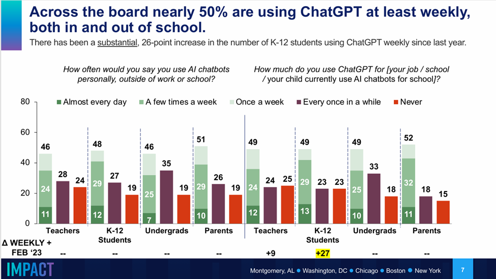
Additionally, LLMs are massively popular. One survey in May 2024 (n=4010) of participants in the education system found that 50% of students and educators were using ChatGPT weekly.
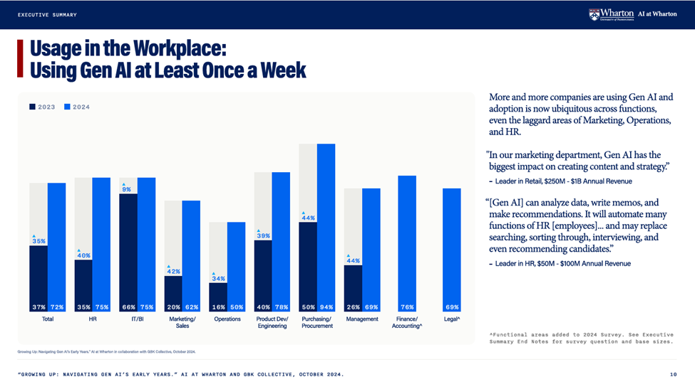
Another survey from the Wharton Business School of 800 business leaders found that weekly usage of AI had from up from 37% in 2023 to 73% in 2024.
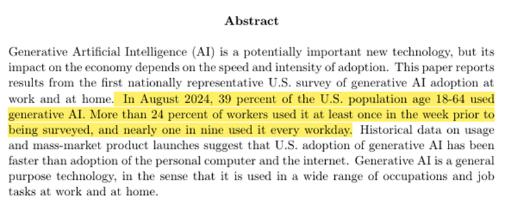
Yet another study found that 24% of US workers aged 18-64 use AI on a weekly basis.
If you think that AI is a problem for society, then I regret to inform you that we irrevocably screwed. The individual benefits and corporate benefits are just too strong and enticing to roll back the clock on this one. Although I do hope for some sort of regulation in this space.
So now what?
While we can vote for and hope for regulation around this, no amount of regulation can completely stop it, in the same way that copyright law has utterly failed to stop pirating and copyright infringement.
Instead, I think the best we can do it to try to hold ourselves and others to a higher ethical standard, no matter how convenient it may be to do otherwise. Below are my opinions on the ethical obligations we have around AI. Many will disagree, and that’s OK! I don’t expect to persuade many of you, in the same way that I’ll never persuade many of my friends to not pirate video games that are still easily available for sale.
Obligations for individuals
As an individual, I encourage you to educate yourself on how LLMs work and their limitations. LLMs are a dangerous tool and you have an obligation to use them wisely.
Additionally, Co-Intelligence Living and Working with AI by Ethan Mollick is a splendid, splendid book on the practical use and ethics of LLMs and can be gotten cheaply at Audible.
If you are using ChatGPT for work, you have an obligation to understand when and how it can train on your chat data (which is does by default). You have an ethical obligation to follow your company’s security and AI policies to avoid accidentally exfiltrating confidential information.
I also strongly encourage you to ask ChatGPT questions in your core area of expertise. This is the best way to understand the jagged frontier of AI capabilities.
Obligations for content creators
If you are a content creator, you have an ethical obligation to not use ChatGPT as a ghostwriter. I think using it for a first pass can be okay and using it for brainstorming or editing is perfectly reasonable. Hold yourself to the same standards to as if you were using a human.
For example, if you are writing a conference abstract and you use ChatGPT, that’s fine. I have a friend who I help edit and refine his abstracts. Although, be aware that if you don’t edit the output, the organizers can tell because it’s going to be mediocre.
But if you paid someone to write an entire technical article and then slapped your name on it, that would be unethical and dishonest. If I found out you were doing that, I would stop reading your blog posts and in private I would encourage others to do the same.
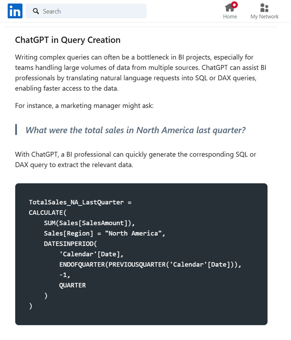
You have an ethical obligation to take responsibility for the content you create and publish. To not do so is functionally littering at best, and actively harmful and malicious at worst. To publish an article about using Power BI for DAX without testing it first is harmful and insulting. Below is an article on LinkedIn with faulty DAX code that subverted the point of the article. Anyone who tried to use the code would have potentially wasted hours troubleshooting.
Don’t put bad code online. Don’t put untested code online. Just don’t.
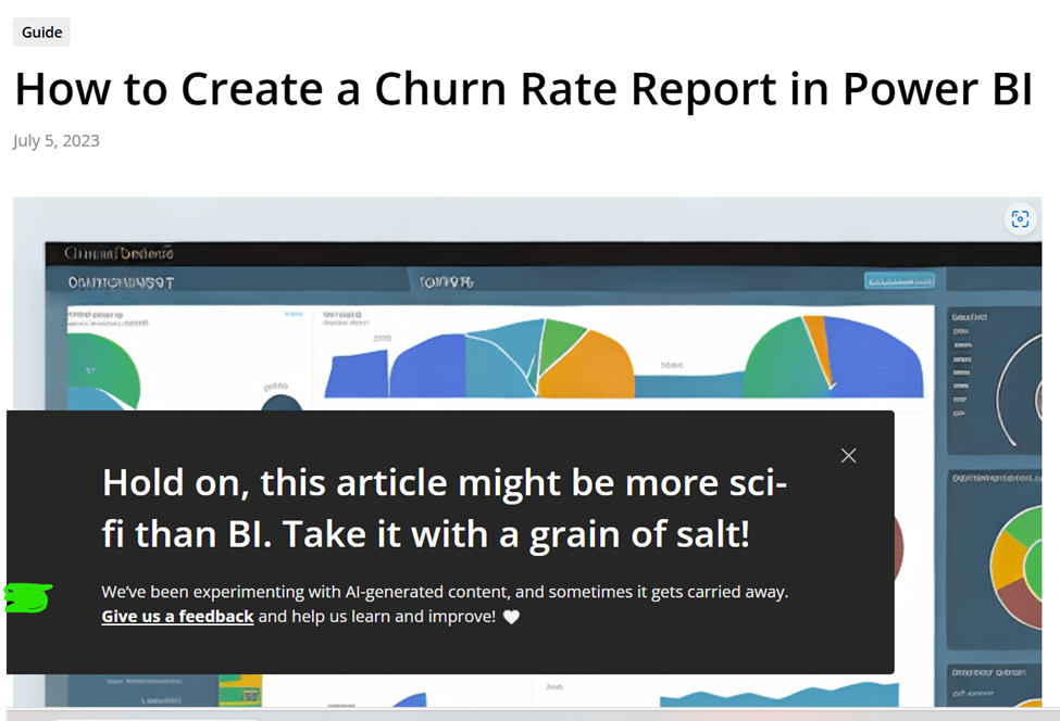
One company in the Power BI space has decided to AI generate articles en masse, with (as far as I can tell), no human review for quality. The one on churn rate analysis is #2 on the search results for Bing.
When you open the page, it’s a bunch of AI generated slop including the ugliest imitation of the Azure Portal I have ever seen. This kind of content is a waste of time and actively harmful.
I will give them credit for at least including a clear disclaimer, so I don’t waste my time. Many people don’t do even that little. Unfortunately, this only shows up when you scroll to the bottom. This means this article wasted 5-10 minutes of my time when I was trying to answer a question on Reddit.
Even more insultingly, they ask for feedback if something is incorrect. So, you are telling me you have decided to mass litter content on the internet, wasting people’s time with inaccurate posts and you want me to do free labor to clean up your mess and benefit your company’s bottom line? No. Just no.
Now you may argue “Well, Google and Bing do it with their AI generated snippets. Hundreds of companies are doing it.”. This is the most insulting and condescending excuse I have ever heard. If you are telling me that your ethical bar is set by what trillion dollar corporations are doing, well then perhaps you shouldn’t have customers.
Next, If you endorse an AI product in any capacity, you have an ethical obligation to announce any financial relationship or compensation you receive from that product. I suspect it’s rare for people in our space to properly disclose these financial relationships, and I can understand why. I’ve been on the fence on how much to disclose in my business dealings. However, I think it’s important and I make an effort to do it for any company that I’ve done paid work with, as that introduces a bias into my endorsement.
These tools can produce bad or even harmful code. These tools are extremely good at appearing to be more capable than they actually are. It is easily to violate the data security boundary with these tools and allow them to train their models on confidential data.
For goodness sake, perhaps hold yourself to a higher ethical standard than an influencer on TikTok.
Obligations for companies
Software companies that combine Power BI and AI have an obligation to have crystal clear documentation on how they handle both user privacy and data security. I’m talking architecture diagrams and precise detail about what if any user data touches your servers. A small paragraph is woefully inadequate and encourages bad security practices. Additionally, this privacy and security information should be easily discoverable.
I was able to find three companies selling AI visuals for Power BI. Below is the entirely of the security statements I could find, outside of legalese buried in their terms of service or privacy documents.
While the security details are hinted at in the excerpts below, I’m not a fan of “just trust us, bro”. Any product that is exfiltrating your data beyond the security perimeter needs to be abundantly clear on the exact software architecture and processes used. This includes when and how much data is sent over the wire. Personally, I find the lack of this information to be disappointing.
Product #1
“[Product name] provides a secure connection between LLMs and your data, granting you the freedom to select your desired configuration.”
“Why trust us?
Your data remains your own. We’re committed to upholding the highest standards of data security and privacy, ensuring you maintain full control over your data at all times. With [product name], you can trust that your data is safe and secure.”
“Secure
At [Product name], we value your data privacy. We neither store, log, sell, nor monitor your data.
You Are In Control
We leverage OpenAI’s API in alignment with their recommended security measures. As stated on March 1, 2023, “OpenAI will not use data submitted by customers via our API to train or improve our models.”
Data Logging
[Product name] holds your privacy in the highest regard. We neither log nor store any information. Post each AI Lens session, all memory resides locally within Power BI.”
Product #2
Editors Note: this sentence on appsource was the only mention of security I could find. I found nothing on the product page.
“This functionality is especially valuable when you aim to offer your business users a secure and cost-effective way of interacting with LLMs such as ChatGPT, eliminating the requirement for additional frontend hosting.”
Product #3
“ Security
The data is processed locally in the Power BI report. By default, messages are not stored. We use the OpenAI model API which follows a policy of not training their model with the data it processes.”
“Is it secure? Are all my data sent to OpenAI or Anthropic?
The security and privacy of your data are our top priorities. By default, none of your messages are stored. Your data is processed locally within your Power BI report, ensuring a high level of confidentiality. Interacting with the OpenAI or Anthropic model is designed to be aware only of the schema of your data and the outcomes of queries, enabling it to craft responses to your questions without compromising your information. It’s important to note that the OpenAI and Anthropic API strictly follows a policy of not training its model with any processed data. In essence, both on our end and with the OpenAI or Anthropic API, your data is safeguarded, providing you with a secure and trustworthy experience.”
Clarity about the model being used
Software companies have an obligation to clearly disclose which AI model they are using. There is a huge, huge difference in quality between GPT 3.5, GPT 4o mini, and GPT 4o. Enough so that to not be clear on this is defrauding your customers. Thankfully, some software companies are good about doing this, but not all.
Mention of limitations
Ideally, any company selling you on using AI will at least have some sort of reasonable disclaimer about the limitations of AI and for Power BI, which things AI is not the best at. However, I understand that sales is sales and that I’m not going to win this argument. Still, this frustrates me.
Final thoughts
Thank you all for bearing with me. This was something I really needed to get off my chest.
I don’t plan on stopping using LLMs anytime soon. I use ChatGPT daily in my work and I recently signed up for GitHub Copilot and plan to experiment with that. If I can ever afford access to an F64 SKU, I plan to experiment with Copilot for Fabric and Power BI as well.
If you are concerned about data security, I recommend looking into tools like LM studio and Ollama to safely and securely experiment with local LLMs.
I think if used wisely and cautiously, these can be an amazing tool. We all have an obligation to educate ourselves on the best use of them and their failings. Content creators have an obligation to disclose financial incentives, when they use ChatGPT heavily to create content, and general LLM limitations. Software companies have an obligation to be crystal clear about security and privacy, as well as which models they use.
Three years ago, I started learning about Power BI and I thought, “Man, this is a really crappy replacement for SSRS.” Three years later, that’s still true, it’s a crappy replacement for SSRS. But that’s missing the point. Microsoft’s ambitions are MUCH, MUCH bigger than replacing SSRS.
Let’s review the many tentacles of Power BI; or, Microsoft’s not-so-secret plan to take over the world.
Tentacle 1 – SQL Server
It is unsurprising that Power BI is often compared to SSRS. If you come from a SQL background, there is a good chance that you need to report on the data in your database in some way. While there are a multitude of tools available to do so, often it’s easiest to go with whatever Microsoft recommends. You already paid for it, right?
For many years, that was SSRS. And for half a decade, between 2010 and 2016, not much changed with SSRS. Much like some of the plants at the Phipps conservatory, it wasn’t dead…just dormant.
If you come from the SQL world, this is all old hat by now. Microsoft is investing a lot of time and money into Power BI, so it’s tempting to think that Power BI is replacing SSRS, but it isn’t. If we look at the traditional BI pyramid, Power BI and SSRS occupy two totally different strata.
SSRS is designed for things that need a page number on them. This is generally detail-heavy, pixel perfect kind of work. This kind of operational reporting is descriptive, it tells you facts, but doesn’t add a lot of spin. This is at the base of the pyramid
Once we have the business up and running, we can move from “is” to “ought”. What should we do? Where should we go? This kind of reporting is higher-level, less detail oriented. You are looking at the company as a whole or at multiple years of history. You may drill down deeper, but generally speaking someone else is sweating the small stuff. This kind of reporting is prescriptive and where we find Power BI.
Finally, once we are moving and we are moving in the right direction, we can be even more forward looking and make use of predictive analytics. What’s going to happen in the future? What can the data tell us? This is where tools like Azure Machine learning and R can start to help us.
Power BI and SSRS are aligning
Power BI and SSRS are aligning and getting closer. If Power BI was a drop-in replacement, I wouldn’t expect to see this. I would expect to see Microsoft heavily pushing one over the other and that’s it.
By contrast, look at SSAS tabular and multidimensional modes. Tabular is available in Azure Analysis Services and multidimensional mode isn’t. Yes, I know it’s on the roadmap but it’s definitely not a number one priority. Every time I hear about SSAS, people are talking about tabular mode. In economic terms, DAX and MDX are subsitute goods. Sales of one reduces sales of the other. Think Coke versus Pepsi.
Power BI and SSRS, on the other hand, are complimentary goods. Think peanut butter and jelly. Yes, they are both things you can put on your bread, but they go better together. Yes, I know that seems strange, but look at what’s going on.
Last year, they announced Power BI Report Server, which is basically SSRS server with Power BI rendering on top. This year they announced SSRS rendering in Power BI Premium. Now, whether you are on-premises or in the cloud you use Power BI and SSRS in the same place.
Give it another year, and I bet the alignment is going to get even closer. I bet they will add Power Query as a data input for SSRS, just you wait and see.
Tentacle 2 – CRM, ERP, and business data
Microsoft wants your business data and it wants it badly. Last week I spoke at the Phoenix Power Summit, and I was really out of my element because it was all about business. It was basically 5 conferences in one, focusing mainly on all of the dynamics products (AX, NAV, Great Plains and Dynamics 365).
It was strange walking around the 250 vendors and 4,000 other attendees. Out of everyone there I only knew 2 people. And what those 4,000 people represented was something that I had never fully considered: standing there was Power BI’s core audience. It’s not me and it’s probably not you. It’s Chris in accounting. Let’s meet Chris.
Say hi to Chris
When I first learned about Power BI I was confused. Why did I need Power Query? Why did I need DAX? I already had all this stuff. I had T-SQL and SSIS. And the truth was, those tools weren’t for me, they were for Chris.
So much of this stuff clicked when I came up with the persona of Chris in accounting. This is the kind of person who is great at vlookups, okay at SQL and is stuff in the land of spreadmarts, flat files and Access databases. This person understands the business intricately and just wants to get things done. And many time, she has almost no IT support to get her job done, so she has to make do with the tools she has. For her, Power BI is a life saver.
And walking around me last week was 4000 Chris-es from accounting. This is going to be big.
Microsoft shoots across the bow of Salesforce
It doesn’t take a genius to realize that Microsoft and Salesforce are direct competitors. Both were interested in buying Linkedin, and more recently Microsoft fired a warning shot to Salesforce.
At Ignite, Satya announced the open data initiative along with Adobe and SAP. Guess who isn’t in the picture? That’s right, it’s Salesforce.
Part of that announcement was them talking about the Common Data Service. When I first heard about CDS months ago, I was again confused. It sounded like some weird semantic layer for the data in Dynamics CRM. Maybe useful if your data lives in Dynamics 365, otherwise who the heck cares.
Oooooh boy was I wrong. Microsoft is aiming for something much, much more ambitious than an awkward pseudo-database layer for people who don’t like SQL. They are aiming for a common shape for all of your business data. They want to want to create a lingua franca for all of your business data, no matter where it is. Especially if it’s hiding in Salesforce.
Now, do I expect them to succeed? I’m not sure. I’ve learned the hard way that every business is a unique snowflake, even two business in exact same industry. But if anyone can do it, Microsoft has a good shot. They’ve been buying up CRM / ERP solutions for decades.
Tentacle 3 – Data Science, Machine learning and Azure
Last week I had the pleasure of attending the Phoenix SQL user group and listen to Matthew Roche talk about Power BI Dataflows. When I first heard about dataflows, like everything else in this space, I didn’t quite get it. It sound like Power Query, but for the Power BI Service directly? Weird.
The way Matthew described it made a lot of sense. Dataflows represent an intermediate layer for your data, much like a traditional data warehouse. This is after all of the boring ETL bits, but before all of the sexy BI semantic layer bits. This is, metaphorically, chopping all your broccoli and putting it into plastic bags. The end user still has to decide what the final product looks like.
And guess what shape they let you put your data into? That’s right, the common data service. Microsoft wants to act like as a clearing house for your data. They want to act as a middle man for all of your data sources and all of your data consumption.
One weird thing about dataflows is that it’s saving the results to flat files in a data lake. Now, it was about this point that the DBA in me started freaking out. Why are we storing things in flat files? Flat file databases are older than I am!
(Sidenote: SQL Server 1.0 is about 6 months younger than I am.)
Well apparently, that’s standard fare for data lakes and how they scale. But the part that excites me is all the avenues that opens up. Because you can Bring Your Own Storage Account and gain access to all of that delicious data.
This is some seriously cool stuff.
Summary
Power BI remains a poor replacement for SSRS. But it’s a fine compliment to SSRS and is a growing way to report on the data living in you SQL Server.
For business users, especially Dynamics 365 users, it represents a way to get at and visualize their data. Power BI, PowerApps and Flow represent a huge step forward for business users, especially those stuck living in spreadsheets and access databases.
Finally, Microsoft wants to Power BI and the Common Data Service to be a central hub for all of your business data and analytics. This is going to expand into providing easy ways to take your business data and pipe it into Azure Machine Learning or Azure Databricks.