This is week 1 where I try to take Magic the Gathering draft data to learn Microsoft Fabric. Check out week 0 for some reasoning why.
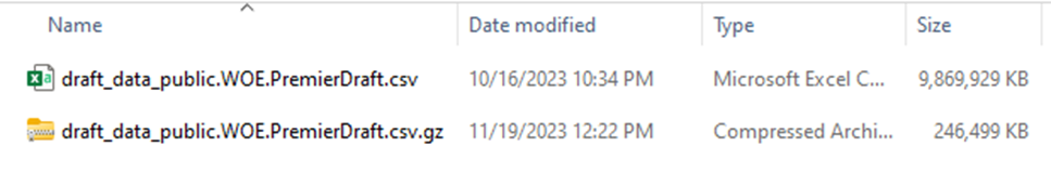
So, before I do anything else, I want to get a sense of the data I’m looking at to see if it’s suitable for this project. I download the data, and because it’s gzipped, I use 7-zip to open it up on windows 10, or Windows explorer on Windows 11. In either case, the first thing I notice is the huge size disparity. When compressed, it is a quarter of a gigabyte. Uncompressed, it’s about 10 GB. This tells us something.
The longer you work in business intelligence, and especially in consulting, the more you start picking up clues and making inferences. You do this because scope creep is extremely prevalent in BI, and if you are a consultant you might be the one paying for it. So, what does 40x compression difference tell us about the data?
40x is abnormal. In my experience with the Vertipaq engine in Power BI, on a good day you are looking at 5-10x compression compared to a SQL backend. So, we know that there is a lot of repeated data. Because this is the only file for this data, we can infer that we will have to do quite a bit of normalization. CSV is a flat format, so the source data is likely heavily denormalized in this case. I would be shocked if there was any nested or hierarchical data like you might expect with JSON.
The next step is to take a peek at the data. There might be documentation somewhere, but for whatever reason I prefer to just take a look and get a feel for it. So how do we do that? Well, someone experienced would probably use a dedicated tool for large files. But I’m not experienced, so I confirm that I have 32 gigs of RAM, double click on the file and cross my fingers. In doing so, I create the most viral tweet of my career.

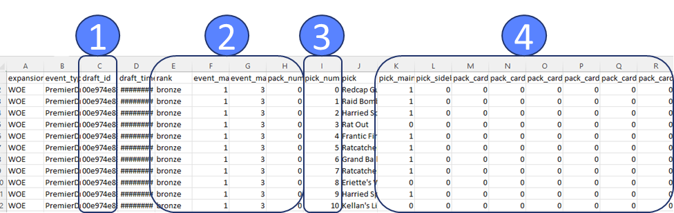
Excel complains that there are too many rows, but eventually shows me the first million of them. I take a quick glance to get oriented. The very first thing I’m scanning for is anything with the word “id” in it (1). The next thing I’m scanning for are repeated values (2), these are likely to go with the id as a header table or dimension table. Then I see pick number incrementing (3), so it’s likely functioning as a line number. Then I see a bunch of ones and zeros (4) to the right, and I don’t like that.
Issues with the data
I don’t like that because it’s data I don’t know how to deal with. My first guess is it’s data for data science that’s been turned into features. Columns like this are great for running experiments, but awful for traditional analytical reporting. I’ll likely have to reshape the data into something more dimensional, but I’ll have to learn how best to store this information. Doing a pivot is simple enough, but I have a nagging feeling I’m missing something.
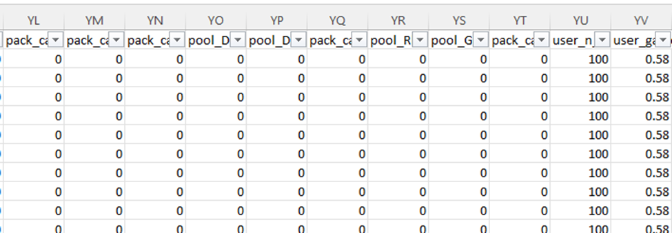
So, the next question, is just how many columns do we have and what do they look like? I scroll over all the way to the right, and I see the letters YS. I don’t know how many that is, but I know it’s bad. Typically, in my work it never gets past A and another letter. I check and there are 672 columns!!!
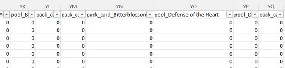
Why so many columns? This data is around drafting Magic the Gathering cards. So, for each card in the specific magic set (a quarterly release of cards), we have a column if it was possibly in that card pack (the cards the player can choose from), as well as in the player’s already selected pool (the cards they’ve drafted). Essentially, for every card they could possibly see in a draft we are tracking what they have seen as well as what they have picked.
Accordingly, we have a very sparse dataset. Based on how the math works out, these columns will have 0 the vast majority of the time. I know that having lots and lots of columns interferes with run-length encoding, so leaving the dataset as is not ideal from a compression and performance standpoint. This does explain why the data compresses so well though, since most of it is long chunks of 0s and commas. The gzip algorithm is able to see that and substitute it.
There’s another issue with this shape. We have columns with specific names of the cards. The cards available each set are completely different, with only a handful of repeats. This means if we just merged in the schema each new set, we would have thousands of columns. This simply isn’t feasible; we have to reshape the data. We are going to need to learn how to dynamically unpivot the data, probably in Azure Data Factory, which I have no experience in.
Coincidentally, Javier Villegas was giving a presentation on data ingestion in the Data Toboggan conference. I think an important part of learning technologies is giving yourself the chance for “serendipity” or “luck”. If you are regularly bumping into content, you can find content that is relevant to the problems you have. As I mentioned in week 0, if you don’t have active problems or active tasks you sometimes have to make your own.
Summary
We can tell the data is abnormally compressible and we need to figure out why. It turns out it is a sparse data set. The first thing I do is rapidly scan for id fields, numerically incrementing fields, and repeated values to get a sense of how I might normalize the data. Based on the current shape of the data, I know I’m going to have to pivot it. I’ll probably have to learn Azure Data Factory for that, but we’ll see. I know vaguely that Fabric has support for PowerQuery.
Leave a Reply